log

User eXperience and Product Design of Complex Systems, Cross-Channel experience ,Experience Strategy

About Me

I'm an experienced UX designer. I specialize in identifying and analyzing users' needs and in designing of digital products that serve these needs with great success!  I am also a lecturer of UX, HCI and Product Innovation at the University of Haifa.

My Calling

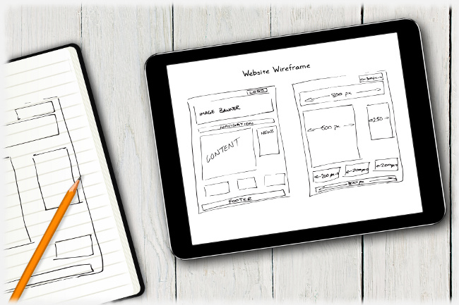
My name is Shay Ben-Barak and as an expert (M.Sc.) in UX, I lead projects from idea through wireframes to visual design. My services include user research, need analysis, task (usage) analysis, UX concept and design of wireframes and behaviour. I cooperate with first class Art Directors to achieve high-end visual design.

When I was about 16 years old I read an article about cars' ergonomics in a youth journal. Ever since, I knew that human-technology interface, usability, user-experience (call it whatever you like) was my vocation, and although I've been doing it for a while now, I'm still all enthusiastic about experience and product design.

My Know How

In the last two decades I've been deeply involved in the design of user experience for products that were targeted for diverse users and technical platforms. I led projects from the early inventive stages of understanding the users' needs, throughout the process of concept design, detailed interaction design, and also guided the phases of visual design and coding of the product. I'm familiar with mobile devices, native applications (Windows and others) and with web applications. I have experience both with consumer apps and with complex systems -e.g. financial, medical, control and monitoring systems (C4I). I've been hired by all kinds of organizations - from small startup companies to government and international corporations.

I have a master's degree (M.Sc.) in cognitive science from the Technion. It means that I know a great deal about human perception, about skills and how they are being acquired, about learning processes, and about human information processing. My master thesis is about Mental Models, and it was published in chapter 5 in this book.

Since 2019 I teach advanced UX-design course in the HCI graduate program of the University of Haifa.

I'm a UX mentor (pro bono) at Google for Startups Accelerator - a global acceleration program that helps startups build and scale great products.

SERVICES

From hands-on screen layout design, wireframes and UX specifications documents, to evaluation and experience strategy plans. Visual design is done by first-class Art Directors that I cooperate with.

Strategy & Brainstorm

Joining and guiding your team of designers, product owners, engineering and decision makers in the process of designing the long-term cross-channel experience with your product or service. As a Google Certified Sprint Master, I can also moderate a Design Sprint workshop.

Design

Design of products and services that satisfy the users' needs, suit their workflows, and are fun to use. The project is done in a tight collaboration with product managers and decision makers, and the final deliverables can vary from wireframes prototype or functional demo to detailed specification document.

Visual Design

Great visual design is an important part of the experience, and it must be done by superior professionals. Therefore, I have established ongoing business relationships with top-level visual designers that can give a perfect "final touch" to your product. I can offer the “full package” and take responsibility for the visual designers’ work and deliverables, but I can also work with your company designer, or with your preferred studio.

Evaluation

From fast and compact heuristic evaluation to full-scale usability testing. The evaluation of an existing interface or a prototype shall point out usability challenges, and the report will also include optional solutions.

Vision

Design for a purpose, establish a robust experience strategy, design productive and joyful interaction that also looks great. Always test and constructively criticize your ideas and design.

UXD Process

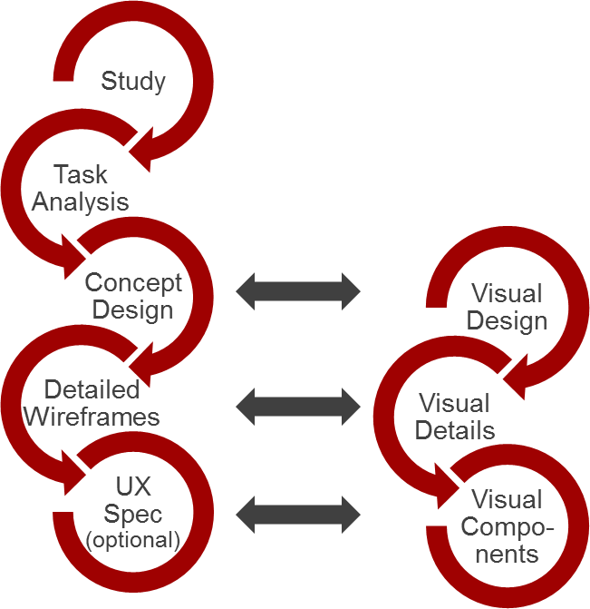
A User eXperience project requires tight collaboration with product owners and decision makers, and in many cases the list of required features and functions is revisited and being refined as usage scenarios are being reviled and made clear. The typical path is shown in the next figure, but in many cases it is not a linear process as testing and validation results call for changes and updates of previous phases’ outputs.


UX Process

Design for a purpose

I observe users and study their work environment, their behavior, and their typical workflows. When I cannot do that due to project constraints, I try to that by interviewing agents who know the users and work with them on a daily basis. When that is not possible either, I synthetically script and analyze potential behavior and expectation. My aim is to elicit what are the users’ needs (rather than their wishes) in order to achieve design for a purpose.

When I understand the users’ tasks, their required workflows, and their expectations, it time for conceptual design of the experience; time to think about devices and platforms and to develop the navigation model, the orientation aids, and the application dialogue style. This is also where creativity and innovation are playing an important part, with care, though, since users usually tend to feel at ease in a familiar environment. The secret is to wisely balance workflow support with cool interaction and familiar tools, with up-to-date layout and visual design.

Test

The best practice of usability testing is often neglected, which is a shame as many software products hit the market before they are ready. There is no second chance for first impression, so test your product! Testing means to test the product with typical users on a typical usage scenario and to study their performance. Testing is not interviewing and not asking users what they think; you actually need to observe them struggle with your product and notice where they get stuck and where (and if) they are delighted.

Experience Strategy

Products begin with the technology that makes them possible. Years ago, the introduction of a new technology was all that you needed to go to market. What mattered was that you could do something others couldn't. Later, when technology became easy to copy, you had to have more features in order to boost a product. Nowadays, consumers are sophisticated enough to seek the experience rather than complex features.

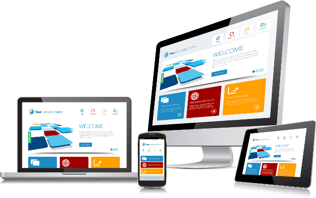
Consumers and professionals expect to be able to act upon a product or a service seamlessly, across multiple channels, and what counts is the overall experience they are going through while satisfying their needs. If you are only focused on requirements and features, you'll end up with an unsatisfactory experience.

Cross Platform
You must form your
Experience Strategy

You must deal with the whole consumption cycle: from encountering and getting to know a product, through the embracing or buying experience, to the actual consumption of the product or service and the ongoing experience. You must realize that each of these sub-experiences can begin on one channel and move to another - it is the era of cross-channel experience.

Blog

There are so many blogs about User eXperience and product design out there; most of them are in English. My blog is usually in Hebrew, but there are English posts, as well. I’m doing an effort to be genuine, to bring intelligent examples and how-to advice, while also explaining the reason beyond it. You are most welcome to read and to comment.

Onboarding Process Analysis

Onboarding Funnel Analysis

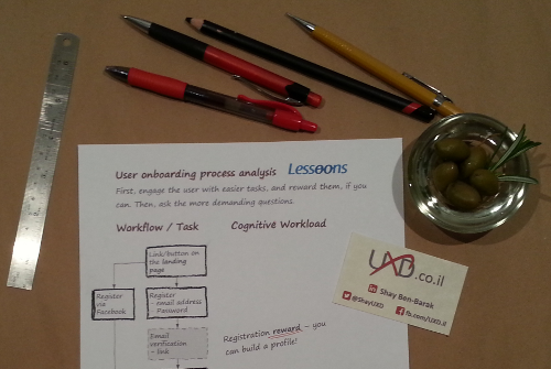
Lessoons is a platform connecting students with private tutors. It's available in Hebrew for the time being, and we are making our first steps in acquiring users. Tutors need to create public profile with skills, location and pricing, plus a descriptive introduction that represents their personal voice. Users that own a profile can share it over social networks.

How to get a user to invest in creating a representative profile – a task that sometimes can be grasped as annoying? Demographics and skills selection (out of a structured list) were not expected to be perceived as demanding tasks in nature. In contrast, composing one’s own personal voice and deciding about tutoring-fees to be published on the internet, require more thought and creativity which means higher mental effort.

Annoying Hotel Room

Good Intentions Paved the Way to this Annoying Hotel Room

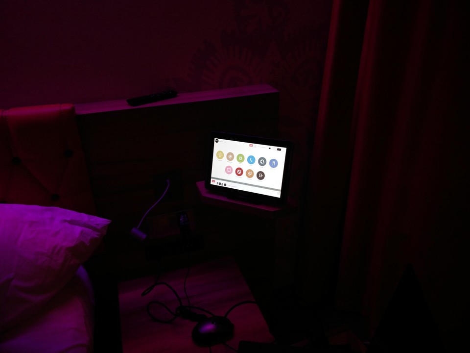
In this hotel room there are no light switches! All you get is this tablet. When you enter the room, lights are switched on automatically, so you won't need to search your way in the dark, and you get 4-5 minutes to put the room-card in its pocket (that's more than enough). This is great!

Now let's have a look on the downsides of this ill-designed setting

  • When you are looking for that specific article of clothing in your suitcase, or for your wallet in the room's safe-box, and you want to switch on the light at the entrance, your instinct would probably be to switch the light on. Right? Yet, there is no switch nearby - go fetch the tablet.
  • When you get up to use the restroom, while it's still dark, would you like the restroom to be flooded with white-light that burns your sight and wakes you up? No? This shit is automatic!
  • Now there is the co-operation of this Samsung tablet with the Samsung smart TV in the room. Co-operation? Well, you can switch channels on the TV using the table, but what about the more challenging task of controlling the TV's apps? It's almost obvious to utilize the tablet here as a keyboard, but surprisingly it didn’t crossed the mind of Samsung's engineers - you will need to use the TV's on-screen keyboard and operate it using the remote control - a super frustrating task. Eventually, you will end up with the TV stuck on playing your favorite radio station (using TuneIn app) over the soundtrack of the selected TV channel - use the tablet to call the reception and ask them to rest the TV.

I truly love technology and gadgets, but these artifacts aren't really helpful, if they are not designed for non-techy humans, and if they are not tested with such users through common scenarios. In such case they are actually annoying and unlikable.

UX is not only digital

Two minutes project

This is something I prepared when I was 16 or 17 years old. Only years later I’ve come to realize that it is actually a UX project and one with a lesson to learn.

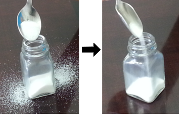
The problem was the mess we got around the salt-shaker after feeding it with a teaspoon, and I’ve saved it by bending the teaspoon to fit with the salt-shaker opening (see the picture for before and after). Simple, isn’t it? Why bother with writing about it? And anyway, we could use a funnel to feel the shaker.

Glass

Well, you could have, but that’s exactly the point – with the bent teaspoon the process is much more efficient and precise, but the user need not learn anything new or to use any additional tool; they get to keep the very same workflow they are already accustomed to with an improved tool that supports them in achieving much better results.

Same workflow, same habit, but with a suitable tool – better achievements in less time! Two-minute UX project with a lesson to learn. Done.

Typewriter

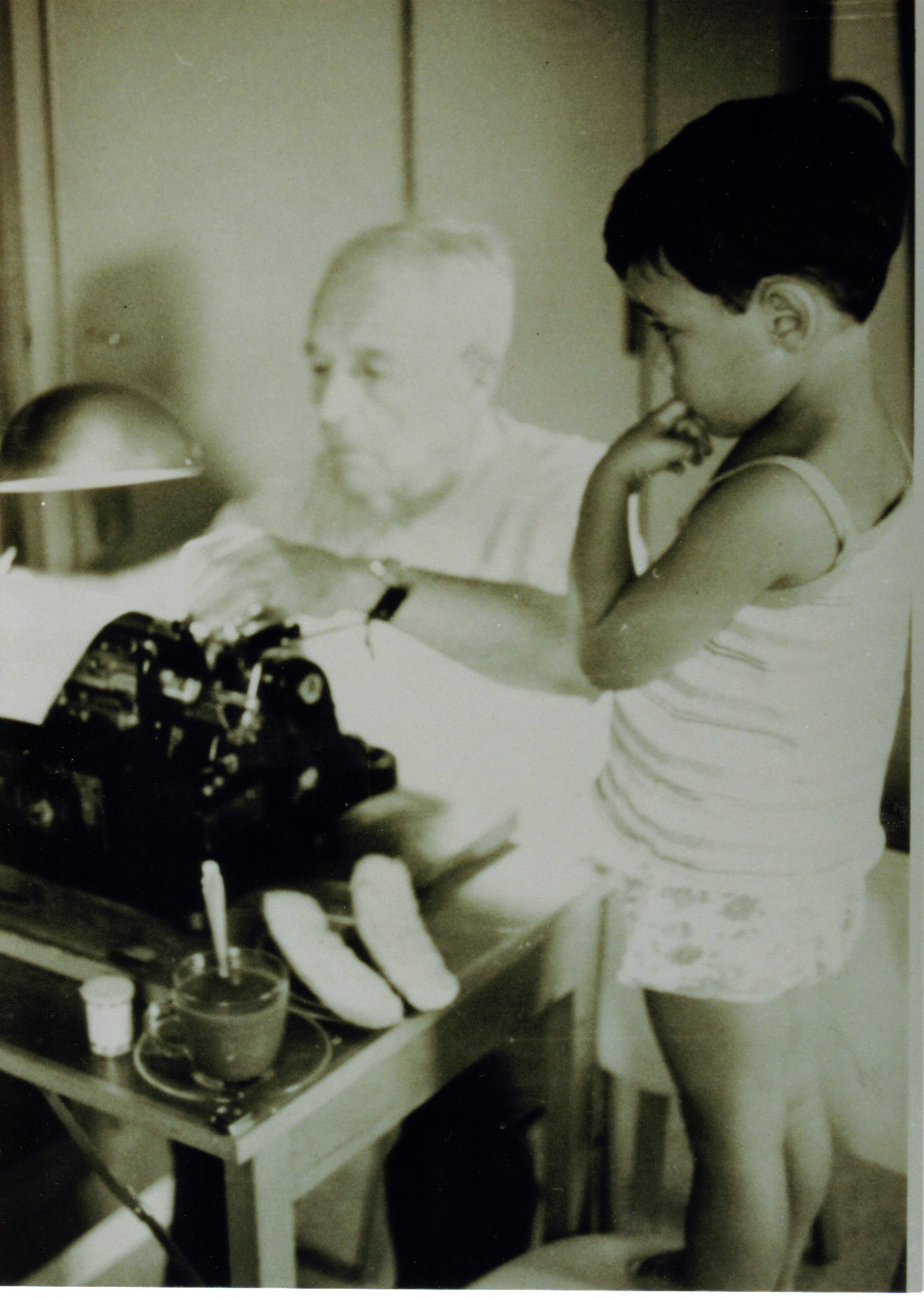
Great-grandpa and I at the old typewriter

מקלדות ומה אפשר ללמוד מהן על אסטרטגית מוצר ועל חוויית משתמש

אנחנו יודעים שתסדיר ה-QWERTY במקלדת הלטינית נולד מאילוץ טכני – הוא תוכנן כך שאותיות המופיעות בשפה בשכיחות גבוהה זו ליד זו, יהיו רחוקות זו מזו במקלדת. ראיתם פעם מכונות כתיבה ישנה? לכל אות יש זרוע, שכאשר לוחצים על המקש, היא עולה להטביע את צורת האות על הדף ונופלת חזרה למקום. אם הזרוע הסמוכה מתחילה לעלות, לפני שהזרוע הקודמת נפלה חזרה למקום, הן עלולות להתפס זו בזו. סידור ה-QWERTY נועד כדי להפחית את השכיחות לארוע כזה.

Glass

האם מסוכן לשוחח בטלפון בעת הנהיגה ואיך זה קשור למשקפי גוגל

  • שיחה בטלפון בזמן נהיגה היא מסוכנת, אבל אפשר לשפר את היכולת הזו ולהפחית את הסיכון. נהגים מנוסים גם יודעים להעריך את תנאי הנהיגה ולהחליט אם לקיים שיחה או לדחות אותה.
  • נהגים צעירים לוקים בהערכת יתר בנוגע ליכולות שלהם וכשהם משוחחים בטלפון, בזמן הנהיגה, הם מסכנים את עצמם ואת הסביבה!
  • משקפי גוגל עשויים לצור עומס לא מבוקר על מערכת הקשב האנושית ולכן הם עשויים להכשיל משתמשים לא מיומנים. זהו איננו המוצר הבא של ההמונים, אבל יש לו שימושים מאוד מגניבים עבור מקצוענים.

ראיון רדיו: חוויית משתמש ליזמים

חשבתם שחוויית משתמש היא עוד שלב בפרויקט?
חישבו שוב!

...סטרטאפים רבים, נקלעים לאפקט איקאה, כשהם קופצים לשלבי הפיתוח של המוצר מבלי להשלים את השלבים שצריכים לבוא לפני הפיתוח, וכך הם מתמקדים למעשה בפתרון ולא בבעיה. איך להמנע מכשל כזה ועוד הרבה קישורים שמשלימים את הראיון – במאמר המלא.

Bowling

Gamification (מישחוּק)

מישחוּק וכמה מילים על playfulness

התחום של gamification (מישחוּק) עושה עכשיו הרבה רעש ב"תעשייה" והוא קנה לו הרבה נאמנים. היישום העיקרי (ולמיטב הבנתי היחיד) של מישחוק הוא לטובת יצירת מעורבות (engagement) או לשימורהּ. המנגנון העקרוני הוא פשוט וכמעט שאיננו משתנה ממשחק למשחק: המשתמש מרוויח נקודות במשחק ואח"כ עולה רמה (level) או מקבל אותות (badges) מסוגים שונים ויש גם לוחות דירוג בין משתתפים במשחק (leaderboards). מה שלא תמיד פשוט הוא בחירת נושא (theme) ראוי למשחק והכיוונון הנכון של הפרמטרים.

בקהילה האקדמית אין הסכמה על כך שיש יתרון למנגנונים של gamification לאורך זמן. יש חוקרים רבים שסבורים ששימוש במנגנוני מישחוק דווקא פוגע בהנעה הפנימית (intrinsic motivation) של המשתמש לטווח הרחוק, במקרה הגרוע; או במקרה הטוב לא משפיע לכאן או לכאן.

Cube

סיפור על קובייה שלא היה בה צורך

הדרישה שקיבלנו היתה לצור חוויית משתמש תלת-מימדית. לא עזרו כל השגותינו, על כך שהמסך הוא שטוח (הא!הא! שטוח כן, לא תלת מימדי) ושאיכות התגובה שלו למגע לא מן המשובחות, שקשה עד לא-סביר למדל התנהגויות במרחב תלת-מימדי בתנאים כאלה ושמשתמשים בכלל לא זקוקים לחווייה תלת ממדית מגניבה; בוודאי שלא זקוקים לזה כל עוד לא התמודדנו באומץ עם בניית מודל ניווט סביר בתפריטי המכשיר. למרות הכל, דרשו במפגיע: תנו לנו חוויית תלת-מימד!

איך לקצר את יום העבודה

מקיצור יום העבודה (או לפחות קצת התייעלות) ועד לאפיון נכון של התראות באפליקציות

נתחיל מהסוף. אתם כותבים קוד או הצעת מחיר, מרכיבים סקיצה חדשה או מסמך; לא משנה מה – נכנס דוא"ל חדש, אתם עוברים לבדוק אותו. במקרה הטוב אתם מסיימים את המשפט קודם, במקרה הגרוע, זה עולה לכם על המסך במין אנימציה, לוכד את תשומת הלב שלכם, וקוטע לכם את חוט המחשבה. אני כבר לא מדבר על זה שהרשתות החברתיות למיניהן פתוחות בדפדפן או בטלפון וגם הן בתורן מכניסות התראות והודעות. יש לזה מחיר וזה יקר.

Contact

You are most welcome to follow UXD on the social networks and communicate.
The UXD Facebook page, particularly, contains the most relevant UX and product links and gets updated at least twice a week (like it to stay tuned).

Call / email

Socialize